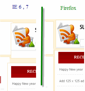
Most of us might have noticed that our sites may look different in different screen resolutions. Though I have already posted one article on making website layout cross browser compatible , but its also necessary to make your site compatible for different screen resolutions. The visitors of your site will not have same screen resolution your are using. So it's mandatory to make your site compatible for different screen resolutions. For example, In lower screen resolutions like 800x600 px the website layout will be perfect. But when you look at your site at a higher screen resolution like 1024x768 px or even higher , the website header or sidebar may be aligned to either right or left. It's all because the designer might have designed the site for a particular screen resolution. In the screen resolution he was working , the site may look perfect. But when it comes to higher screen resolution , the theme may be misaligned.
what is the best screen resolution settings?
One can't design a website for a particular screen resolution, because visitors will have different screen resolutions. According to me , the best screen resolution on which the designer should be concentrating on should be higher than 1024px. For example if you take techieblogger's last month stats , most of my visitors are using higher screen resolution.

Some of the web designers use JavaScript to control the screen resolution compatibility. But it will reduce the site loading time.Instead of using JavaScript , I will explain how to make your site higher screen resolution compatible by making changes in CSS codes.
CSS controlling the alignment of the layout
Before explaining the original hack, first let me describe about the css code which controls the layout alignment.
The simple margin tag in CSS controls the alignment of the site layout in different screen resolutions. I have selected auto to change the layout alignment in accordance with the visitors screen resolution.
Screen resolution compatible CSS - Blogger users
In order to make changes to your CSS code in blogger blogs , follow the below steps.step 1 : First go to Layout section of your blog.
step2 : Then navigate to EDIT HTML page
Now add the margin: auto; tag in the css codes of the following sections.
- Header
- Outer wrapper
- content wrapper
- wrapper
- Footer
If one more sections are missing in your style sheet , then insert that code in the respective div sections used in your blogger template.
Screen resolution compatible CSS - Wordpress Users
To edit the css code in your wordpress blogs, follow the below steps.
first go to appearance option in your wordpress dashboard. Then go to EDITOR page. In that page , add the css code margin: auto; in the following css sections.
- Header
- Outer wrapper
- content wrapper
- wrapper
- single entry
- Footer
how to change screen resolution
For checking your site compatibility with different screen resolutions do any one of the below steps.
how to get a higher screen resolution on windows vista/XP
To change the screen resolution of your PC , do the following steps.Right click on your desktop , then click the option "Properties" there.A new window will open. Now navigate to "settings " tab. There you can see a slider to change the screen resolution. With that slider you can either increase or decrease. After you chose a particular screen resolution , click apply. It will give you a warning message click "ok".

Now open the browser and visit your site for compatibility.
how to set screen resolution using keyboard hotkey
You can also check the compatibility of your site with different screen resolutions with simple keyboard short keys.
First go to your blog and do the following :
To reduce the screen resolution , press "ctrl" and scroll down the mouse roller.
Or
press " ctrl " button and press "-" button.
To increase the screen resolution, click "ctrl" and "+" button or else press " ctrl " and scroll up the mouse roller.
With the above keyboards hotkeys , you can check the screen resolution compatibility of your site.
Hope this article will be useful for all web designers who want to create wordpress themes or blogger templates which are higher screen resolution compatible. If you have any problem with your website layout alignment, then please email me about the issue.

